Dairy Queen Kiosk
UI • UX • Heuristic Evaluation • Brand Identity
Designing a self-service kiosk for DQ locations.
Overview
Aiming to provide a quick, intuitive, and pleasant user experience for ordering items at Dairy Queen's (DQ's) restaurants.
Timeline - 15 weeks
Tools - Figma, Illustrator, Cardboard, Tape
View Process Deck
(Google Drive PDF)
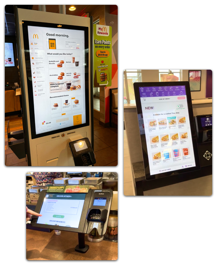
Heuristic Evaluation
I visited kiosks at Taco Bell, Panera Bread, and McDonald's to find successful elements as well as common pitfalls. You can view my deep-dive into the Crumbl Cookies kiosk below.
Takeaways
- Enforce limits
- Provide error prevention & guidance
- Allow flexibility (a way out)
(Google Drive PDF)
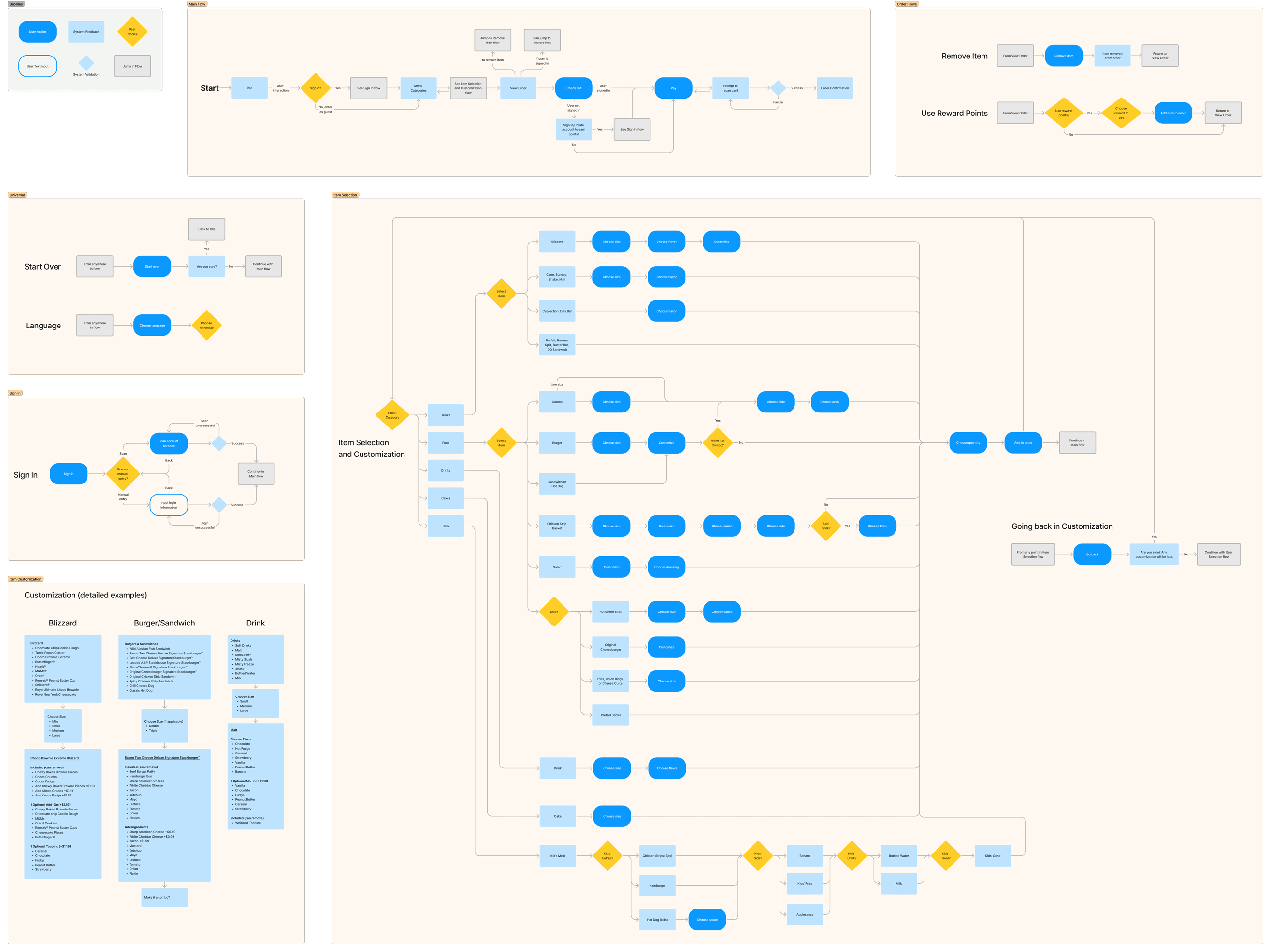
Workflows
I determined what choices a user may need to take and organized them into workflows.
- Item Customization
- Signed-in vs. Guest
- Error Messaging
This helped to determine what screens, popups, or item options would be needed in the interface.
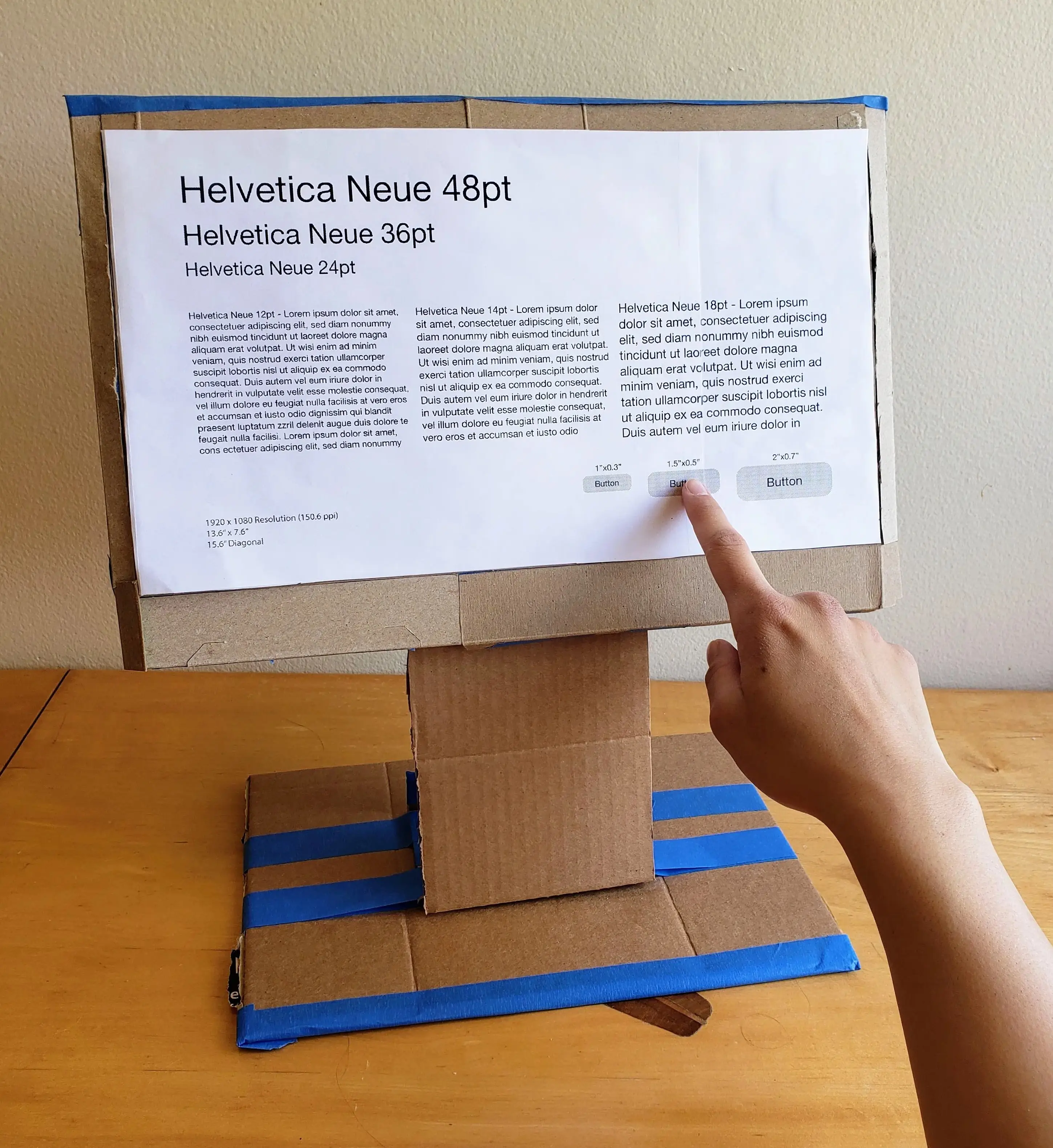
Physical Mockup
I created a full scale physical mockup of the kiosk in order to appropriately size buttons and text in the interface.
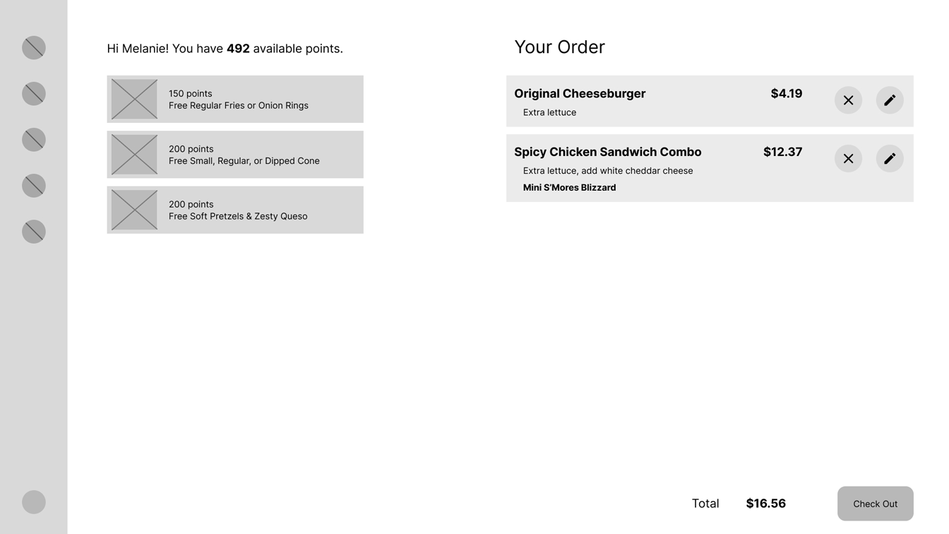
Wireframe Iterations
Since the side navigation bar is mostly needed when a user first enters the menu, it collapses on subsequent pages, providing more real estate for the main page content.
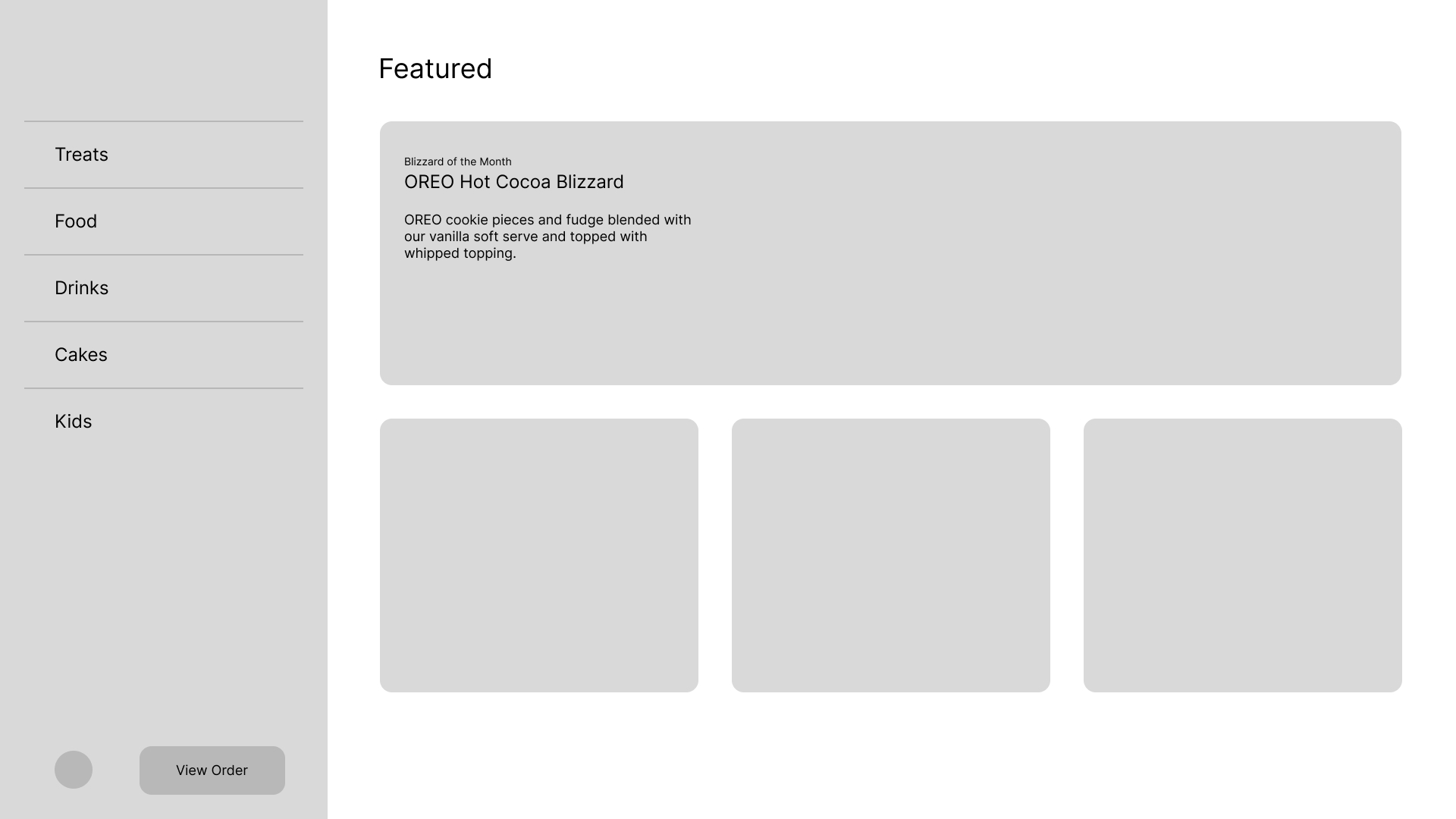
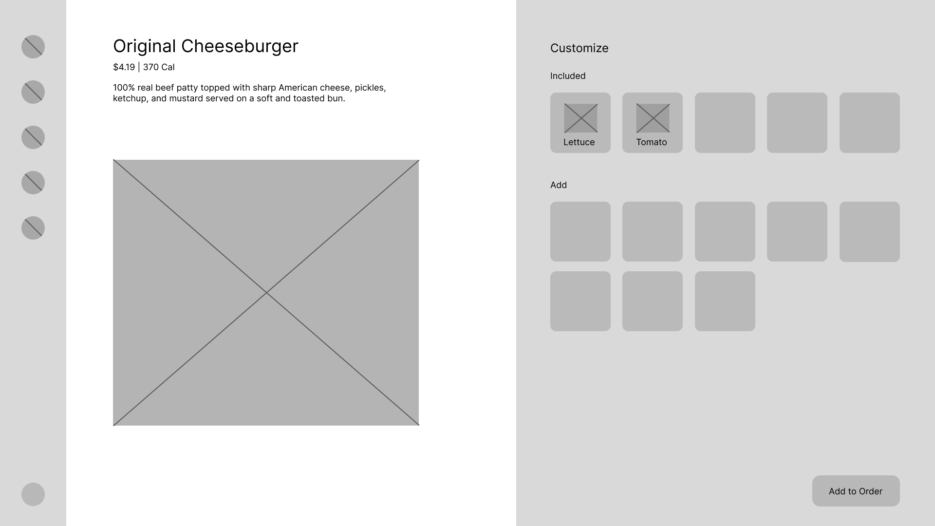
Initial version of home and selected product pages.
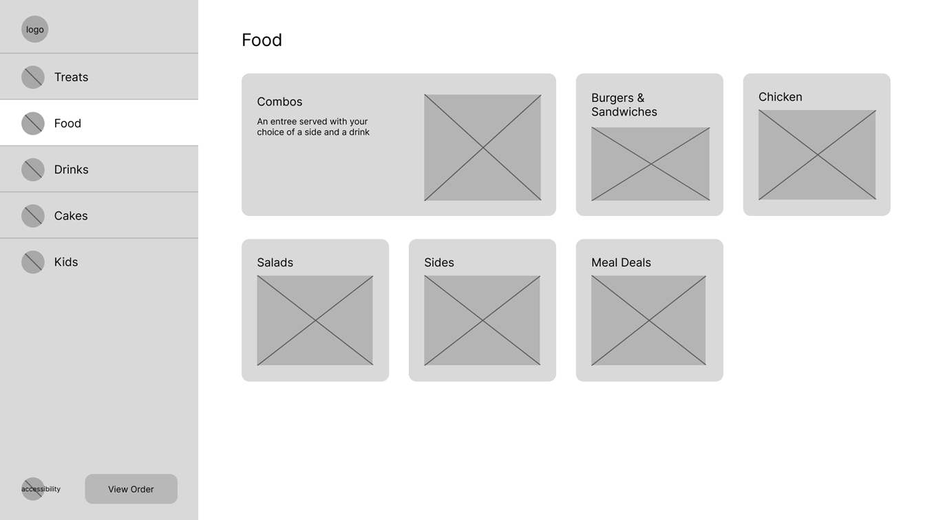
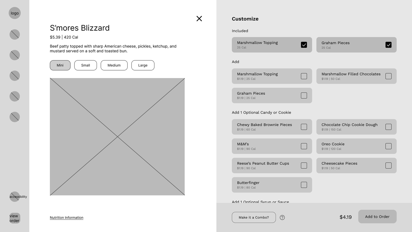
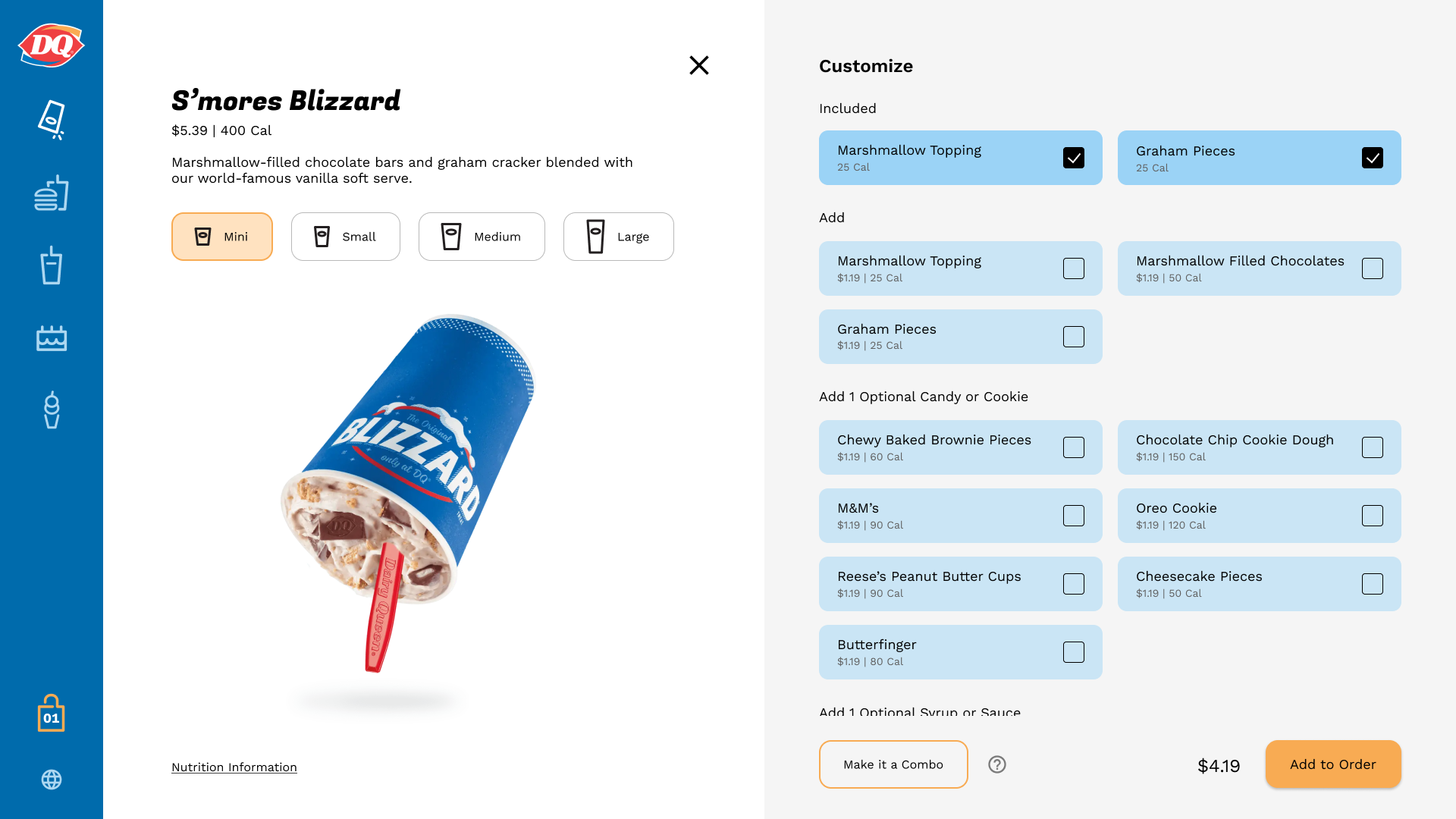
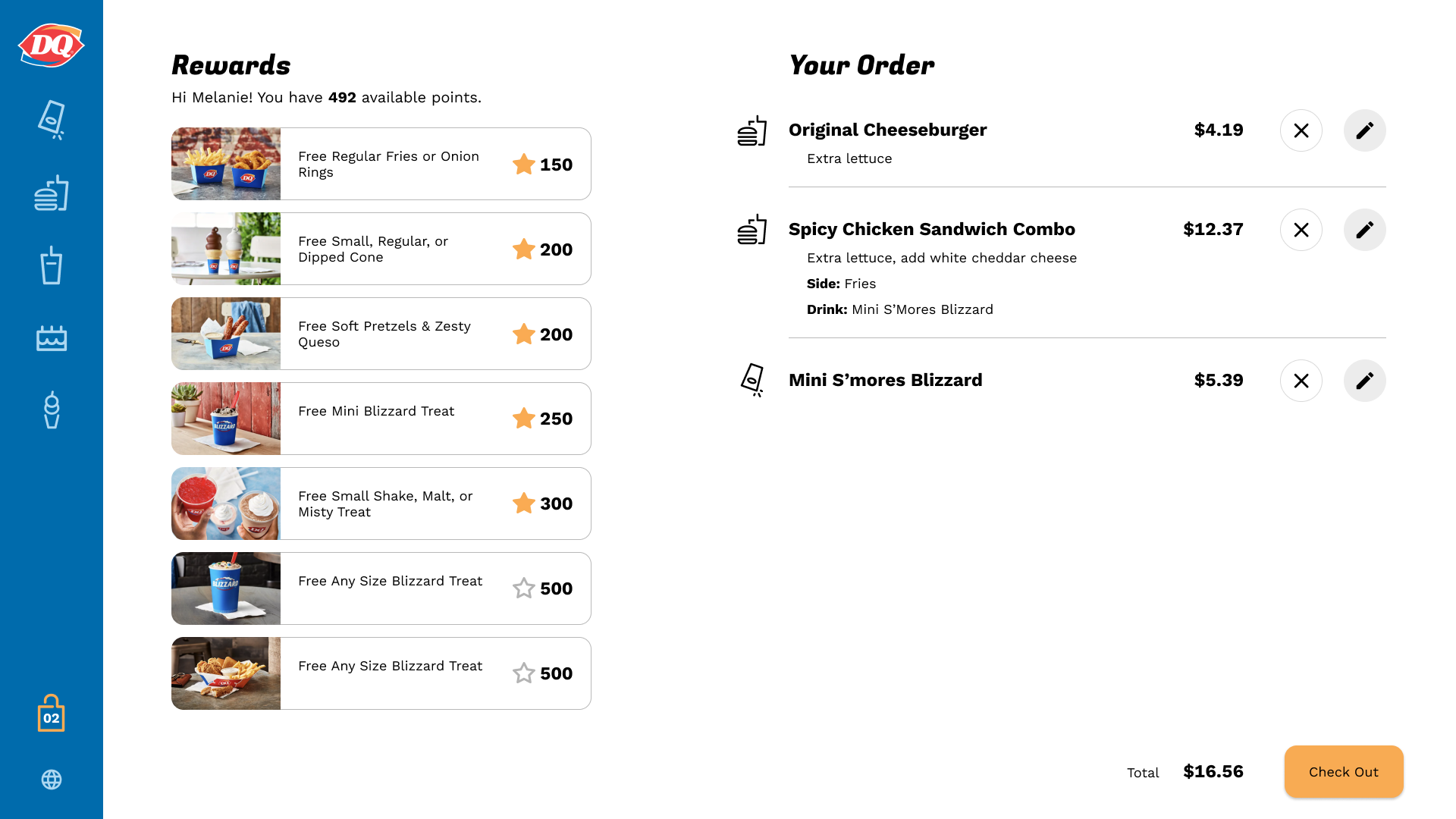
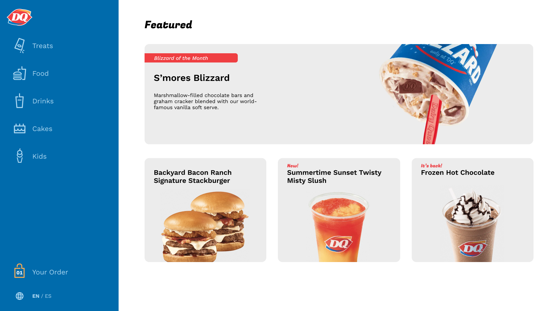
Final wireframes
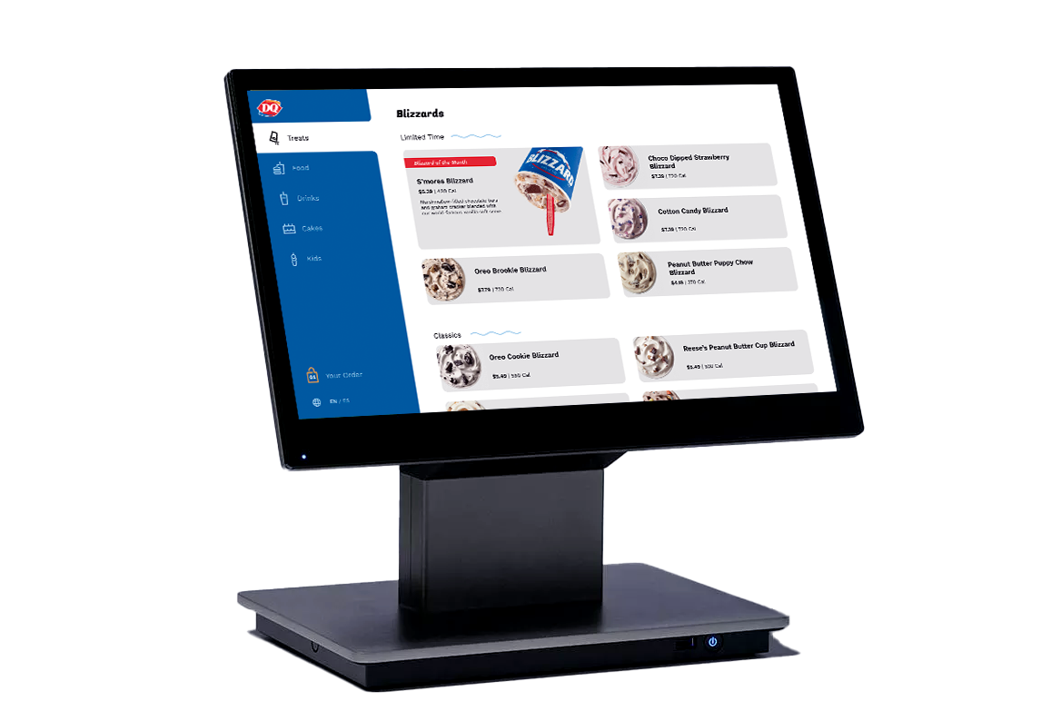
Final Designs
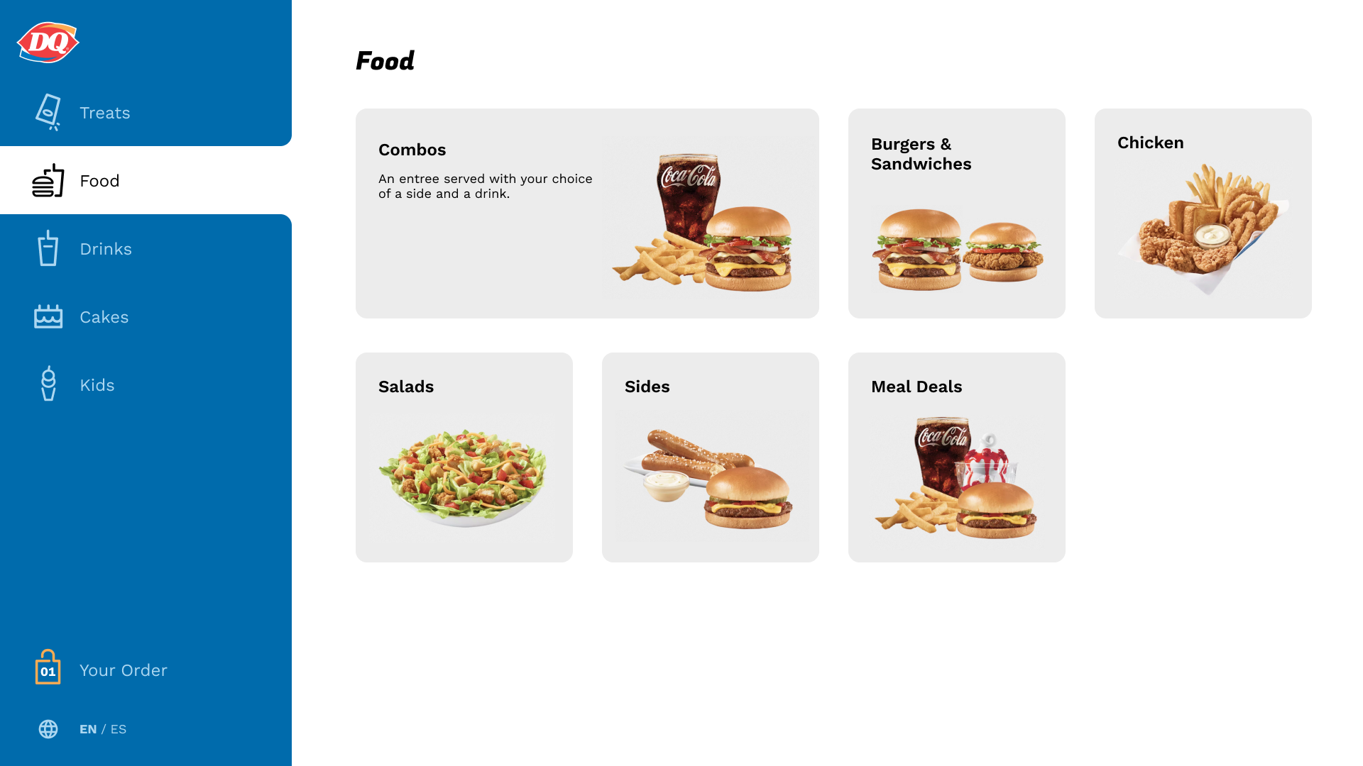
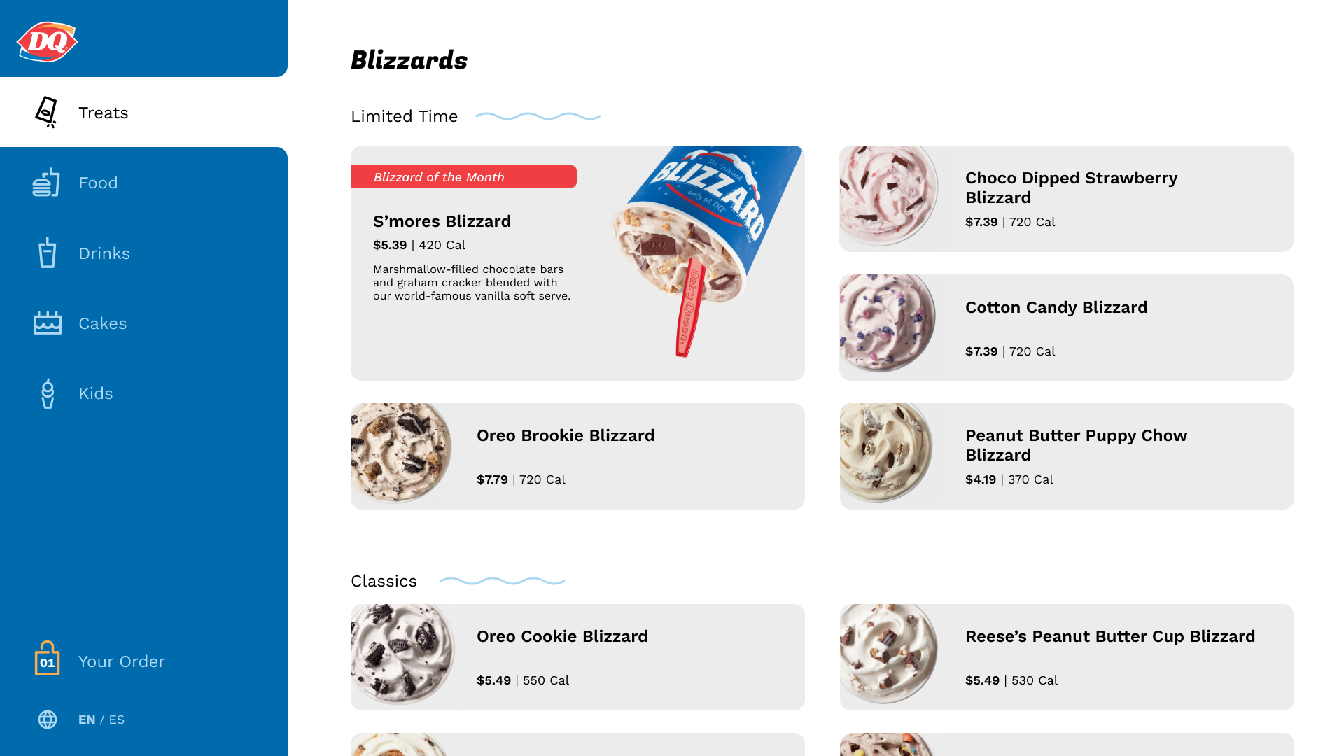
I took style pointers from DQ's existing website and mobile app when choosing my own color palette and design language.
To reflect this style, the final design included playful icons, bright colors, rounded corners, and expressive type.
Prototype
This prototype goes through a user's experience choosing and ordering items from DQ's menu.
Next Steps
Given more time, I would flesh out the beginning and end of the user's flow, making the idle screen and checkout process more robust, both asthetically and functionally.
I would also investigate more error messaging to provide more guidance to the user.